Graphing a Moving Average of a Goodbudget Envelope
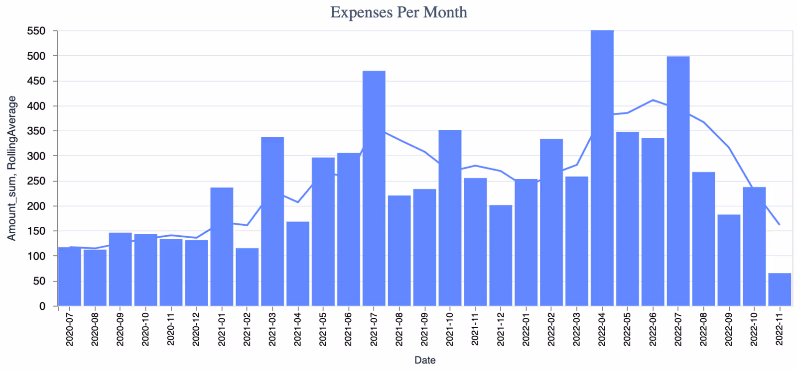
This graph is what my family really spent on Fuel and Uber over the last couple of years, with a 3-month moving average. Skip to The Solution if you want to see how.
Confession
I do not know how to create graphs or charts in Excell. I do not know all that much about data visualization in general, while writing this blog post I googled the definition for “Rolling Average vs Moving Average” and “Graph vs Chart”. I am interested in Machine Learning, but I strongly prefer to learn while solving real-world problems, and until I find a real-world problem that I can solve with Machine Learning, it is going to be difficult for me to learn it.
The Situation
My wife and I do our budget on a spreadsheet. Some things, like our mortgage, are known monthly expenses, the spreadhseet works great for this. But there are other things the spreadsheet is not good for. If we want to know how much we are spending monthly on food, we need to somehow gather that data in order to enter it into the spreadhseet. Also, if halfway through the month we want to go on a date and there is something fun but expensive we could do, it is nice to be able to look somewhere and see how we are tracking toward the monthly amount we decided to spend on monthly expenses. Enter Goodbudget, the budgeting app we use to enter and track our not-easily-known monthly expenses.
The Problem
Goodbudget does not actually answer agregate questions about historical spending (If it does, I have intentionally avoided looking for those features so that I can force myself to increase my data literacy in Elixir).
The Solution
You will need the following:
- Livebook installed.
- Click to download your
history.csvfile from Goodbudget.
![]()